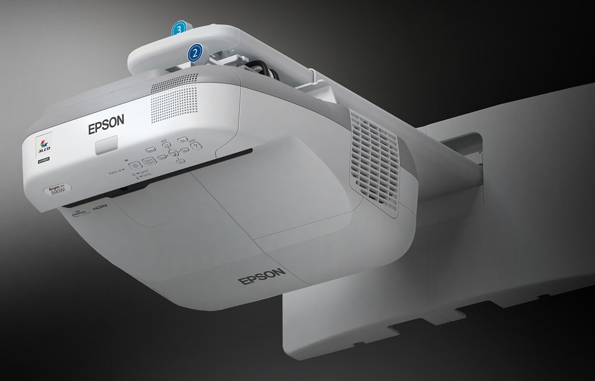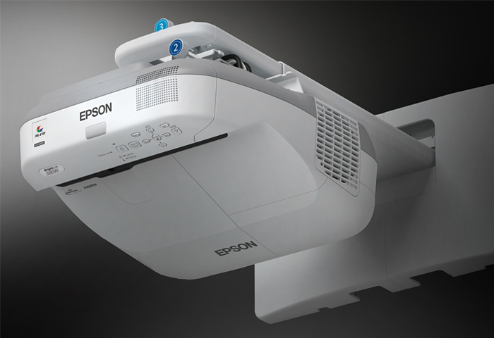
The phrase “truly revolutionary” gets thrown around so much that it’s hard to believe it when a product is billed as such. Given that this overhead projector completely eliminates the need for a pricey interactive whiteboard, opening the door for schools with limited budgets to connect with innovative learning experiences, it’s one of the few products that actually lives up to the claim.
The name BrightLink evocatively captures the projector’s core benefit: connecting students with interactive content via a (literally) bright link. It’s ideally suited for the dynamic teachers who use BrightLink to revolutionize the classroom experience.
From a namescape perspective, BrightLink echoes EPSON’s corporate education initiative, named Brighter Futures. The mutually reinforcing concept of “brightness” brilliantly unifies the brand position with a word that’s perfectly fit for an imaging company.